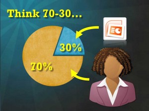
Most visual presentations are 70% visuals (data and text) and 30% presenter. This is the default. It is what is expected. So it is safe. Or is it just boring?
I coach speakers to reverse the trend of relying on text- and numbers-heavy slides for 70% to 80% of their presentation. Strip the bulk from your slides so that you, the presenter, can deliver the critical points orally. You are the expert. Right? Hopefully, your wisdom and insight on the subject is why you are in front of the room. They want to hear your take on it.
Let the slides support, reinforce and illustrate the things that only you, the superstar, can deliver.
You should be the 70%.
