The problem? In a word: boring!
Yes, templates can add some consistency to an otherwise disorganized presentation. And they can give a sense of logic and order to a hodgepodge of mismatched data and facts. (Maybe that is why they are so popular.) But in truth that tactic is just trying to put a fresh coat of paint on a bad presentation. The overall effect is at best robotic. On top of a poorly built presentation a template often just adds boring to the list of flaws.
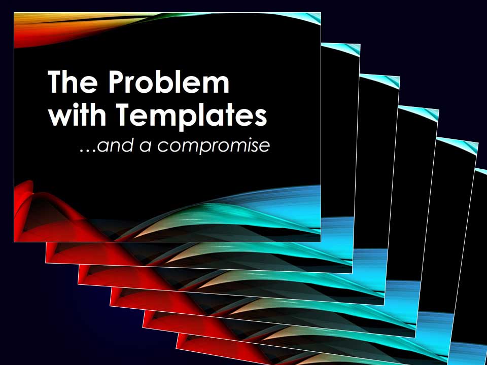
To add to the problem, most mid-sized and larger corporations have created bland, uninspiring templates that they hope will provide some uniformity to their overall PowerPoint branding. But unfortunately, when a badly built presentation is forced into a corporate template the result is often more of the same — bad plus monotonous.
A couple of solutions:
First, create a good, organized, logical presentation. Have a solid, interesting opening, a well-organized middle and a strong conclusion that wraps up your ideas and bring their application to the audience.
Second, if you must use or are being forced to use a template, break up the monotony. Perhaps the opening slide, the section heading slides and the close could adhere to the template. For other slides use full backgrounds and large images or perhaps just a solid white or black frame that covers the template. In other words, mix it up. The template and its branding could then become a guidepost to the viewer that you are starting a new subject or changing pace.
As audience members, we crave contrast and variety. Don’t let a template reduce your best efforts to bland.