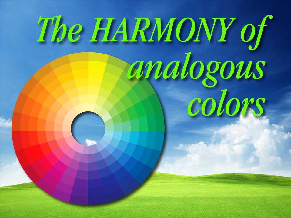
Analogous colors are friendly, happy, harmonious combinations. They are located next to each other on the color wheel and often are used to portray peace and calm. Examples are blue and green; purple and blue; red and orange; and orange and yellow. Think of the pastoral harmony of a blue sky against a green pasture or the comforting warmth of an orange sun setting in a bright red sky.
A few random observations:
- Use them to show compatibility, safety, peace or cooperation.
- Analogous color combinations generally convey low energy.
- There can be contrast problems with design elements like type against analogous backgrounds. Think of how difficult it may be to read blue text against a green background.
- To create separation consider matching the full-strength version of one color with a more subdued version (darker or lighter) of the second color.
Analogous colors may lack the power and energy of action-packed complimentary colors but in the right situation they can deliver a cooperative and collaborative message.
Peace.