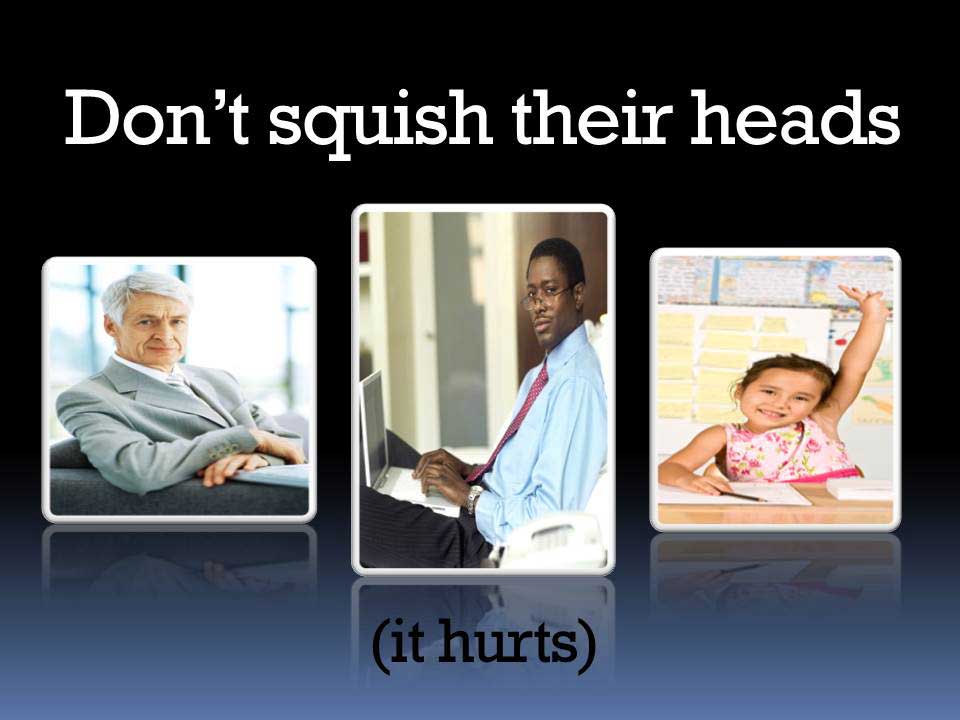
I don’t know if this bothers anyone else — maybe it is just me and my graphic design touchiness. But it makes me crazy when I see distorted images — photos of people and objects (like a basketball) that have been stretched or crushed to make them fit a space. It can be seen all the time in slide decks designed by folks who should know better.
The human eye and brain are very aware of even the slightest of these amateur short cuts and that is just what it looks like — amateurish.
There is an exception of course, you can stretch my photo out just a little to make me look 6′ 2″ and to help me lose those extra pounds…
