/Daily emails

Inspiration is everywhere

Inspiration is everywhere

When you are faced with a project or presentation that seems impenetrable try looking for creative ideas and solutions outside your particular area of expertise or discipline. Years of having to deal with multiple diverse publishing projects taught me to have a mental list of inspiration locations I could visit to get the creative juices flowing. Some of my favorites: card stores, TV sports graphics (this would give me a great excuse to watch Sunday football) and the local quilting fabric stores — fabric designers certainly must be some of the most creative people on the planet. I especially like their ability to experiment with and use color.

There are millions of sources in the real world and online for you to find and “borrow” creative ideas. Often the farther away from your field that you wander the more original and surprising the solutions can be.

By |2018-12-07T19:38:40+00:00January 1st, 2018|Daily emails|Comments Off on Inspiration is everywhere

How to create TED-quality visuals for your next speech

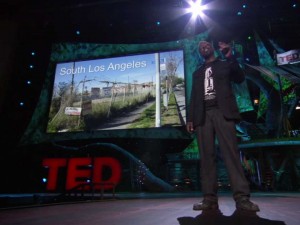
Ron Finley's TED Talk

Ron Finley delivered a brilliant TED speech by mixing sharp attitude, a passion for urban gardening and simple, powerful visuals.

A few years ago, Ron Finley stepped to the center of the TED stage in Long Beach, California and delivered a masterful presentation describing his mission to bring gardening and healthy foods to South Central Los Angeles. Ron has a lot of rough edges to him — especially by the standards of a typical TED audience. His voice and gestures have the attitude and cadence of a hip-hop performer. His words and slides were simple and direct. At times he swore. But Ron (who is not one of my clients) delivered his message as powerfully as any top-tier professional speaker I have ever seen or heard. It was a brilliant performance by both a gifted speaker and his visuals.

If you have not heard this particular TED talk I urge you to watch it — it is less than 11 minutes long. It illustrates so many of the visual techniques and qualities I coach speakers, from every skill level, to adopt. The really cool thing about these slides is they are simple and powerful. Anyone could have created them. No special design skill was required. All they or you have to do is to understand some simple concepts and have a cause to passionately believe in.

One note before you read on: These concepts and suggestions are directed to speakers preparing visuals for a short keynote style talk — maybe under an hour or so in length. Longer, workshop style presentations that seek to deliver quantities of detailed content require somewhat different visual presentation strategies.

How can you craft a great TED-level visual presentation?

1. Write a good speech first. You, and your insights, are the reason for the audience being there and wanting to hear your speech. The visuals should support your speech and your goals not draw attention away from them. Craft your speech without PowerPoint or any other visual program. Make sure it has the focus and the intensity that you want. Then add slides that support and enhance. Ron Finley’s speech was excellent even without visuals. The slides served to elevate his very good speech to an even higher level of connection.

Screenshot (65)2. Use slides with big, bold images and simple words — they are often the perfect combination. Ron’s slides were extremely simple. He used full screen photos of his gardens and close-ups of the people that made them happen. When needed, short concise keywords were overlaid on the images. No special skills were needed to design these slides. The power and simplicity of the visuals helped keep the audience’s attention on Ron – where it belonged.

3. Let visuals do what they do best. (Hint: That’s not to just mirror your words)

  • They can create a mood or backdrop for you to present against.
  • They can tell wonderful stories. Our brains are hardwired to embrace and believe in stories. The earliest humans told tales of food, danger and bravery around their campfires and drew pictures in the dirt and on rocks. As an audience member, I felt immersed as Ron described and then showed how he transformed his urban spaces into an oasis of food.
  • Screenshot (82)They can add a human dimension and build emotion. Not only did Ron’s slides show the real people that made these gardens, he enhanced the audience’s visceral connection by using images of cute kids helping out. It may be an easy trick but it almost always works!
  • They can add humor. Ron’s first slideset was a humorous and spot-on sendup of the clumsy political system in Los Angeles.
  • They can simplify the complex and show scale. Ron’s slide comparing the amount of city-owned abandoned land against the size of New York’s Central Park and then stating how that equals over 725 million tomato plants made the concept crystal clear. It gave a visual and mental scale to the numbers.
  • They can elevate your professional appearance without you having to state it. Poorly designed or confusing slides make a speaker look amateurish. Ron’s “street wise” delivery together with his simple but powerful slides set him up as the no-nonsense expert of his world.
  • They can add a visual channel to your oral delivery by repeating your content in a different format. Words and images appeal to our imaginations in different ways. Together they can help your ideas stick tightly in the minds of the audience.

Some final miscellaneous points:

  • Master your material. Know the content of the slides, where they appear and how they interact with your audience.
  • Master your technology. Nothing takes the enthusiasm out of the audience before you even get started like having to fiddle with the projector and laptop for 5-10 minutes because you were not properly set up. Get there early. Make sure your technology works seamlessly. It will add to your professional demeanor if you can step up and begin smoothly. Be prepared to deliver even if all the technology fails.
  • Use a “clicker” to advance your slides. I usually have two different ones that I bring with me.
  • Have a monitor or laptop within your line of sight so that you can see what is on the screen without having to turn and look.
  • Bring multiple backups of your presentation on different types of media.
  • Rehearse, rehearse and then rehearse some more. Remember: an amateur practices until they get it right; a professional practices until they can’t get it wrong.
  • Although many speakers avoid using visuals and may even scoff at how dreadfully boring PowerPoint presentations can be, images can add much to the intensity and effectiveness of a short presentation. Slides can be a potent tool for the speaker if created and delivered correctly. The right combination of your words plus well thought out visuals can allow you to create a deep and powerful connection with your audience.

Give it a try.

By |2018-12-07T19:38:40+00:00December 17th, 2017|Daily emails|Comments Off on How to create TED-quality visuals for your next speech

Ready?

Ready?

It’s a big presentation. Or it’s a small get-together of your team. You are introduced. Be ready. Begin. Don’t fiddle with the laptop or the projector. Don’t start to set up your slide deck. Don’t shuffle through your notes. Don’t complain, explain or apologize for the fact that everything is not set up, fine-tuned, perfect and ready. Be ready. Begin.

Every presentation, no matter how big or how small is a presentation. It is a performance. The “camera” is always on.

Be ready.

By |2018-12-07T19:38:40+00:00December 14th, 2017|Daily emails|Comments Off on Ready?

Energize a cold audience

Energize a cold audience

Many times a speaker, through no fault of their own, will step to the front of the room and face a cold audience. It could be the time of day, the meal before or after the session, the previous speaker, an organization-wide situation or even the temperature, setup and/or lighting of the room. It could be anything. The energy and the expectations are bottomed out. You may well have to struggle to get the power level up.

There are a number of techniques that a presenter can use to open their time and energize the room – to get people involved and to take notice. The most effective ones involve the audience directly and they fall into three categories: Get them thinking, get them moving or get them talking. Let me give you a few examples of each.

Get them thinking. These are the traditional openings many speech coaches advise. Most of them are cerebral and as you will see ahead are less energizing than physical or interactive openings.

Ask a question. Challenge a widely held belief. Recite a quote. Tell a story. Show a film clip or other multimedia material. And a final strategy, tell a joke. — it will hopefully be relevant to your subject and cause some mental investment on the listener’s part. Be aware that when your audience is cold it may take a lot of thinking on their part to “warm up” to the beginning of your talk.

Get them moving. Movement of any kind – even applause — will almost certainly generate more energy in the room. There are at least two simple techniques I have seen that are effective:

Recognize the person who introduced you or someone who has done a great job in setting up the event and ask the audience to give a warm appreciative applause. This person can be anyone from a meeting planner all the way to the CEO – if they are truly someone who deserves a little thanks for their efforts, the audience will enjoy providing it. I have used this technique and added some lighthearted exaggeration on top by saying the person who introduced me was also here at 5 a.m. mixing up the incredible cheesecake we all just enjoyed.

The other technique is to ask your audience to stand and stretch, stand and say hello to their neighbor or just stand. Asking them to do something like this at the beginning of your presentation can be a little disruptive but if you need a transfer of energy, a quick physical activity may be just the thing.

Get them talking. A trick I borrowed from the brilliant presenters John Maxwell and Les Brown is to get your audience talking to each other. At various points throughout his presentation John Maxwell will often ask his audience members to turn to the person next to them and make a humorous comment on something he has just said.

A tip I learned from Les Brown is to open by asking my audience to turn to the person next to them and say “Good Morning! You look spectacular today!” Then I have the other person return the compliment with “I know. You are looking pretty awesome as well!” This has never failed to be a great ice breaker and energy booster.

The only downside to these techniques is they create a bit of chaos. You may need to let the room settle down before you continue. The chances are however that you will have cured that low energy funk and gotten everyone primed for your spectacular power presentation.

By |2018-12-07T19:38:40+00:00December 10th, 2017|Daily emails|Comments Off on Energize a cold audience

The secret to getting great images

Shutterstock

The secret to getting great images for my slides?

Simple. I pay for them.

Not a lot mind you. I am as cheap (frugal) as the next guy. But one of my best investments is a regular subscription to Shutterstock. There are a lot of other stock image agencies out there (just Google “stock images”) and I am sure many of them are very good and affordable. But I like Shutterstock. For a monthly subscription rate I can search and download up to 350 photographs, layouts or illustrations per month. The images are generally of very high quality, they have a vast library that gives me a great selection of material and best of all, I now own them. That means I can use them, with a few minor restrictions, in any future project. What a deal.

Here is a hidden benefit: I will often have a preconceived concept locked in my mind of what I want the project to look like. After scanning a few pages of the very current Shutterstock offerings on the subject I will develop a whole new perspective on the way things should look. Their stock images and artwork are original and always showing new looks and trends. It inspires my creativity.

Good images are worth the effort and the cost. They will set you apart as a pro.

By |2018-12-07T19:38:41+00:00December 2nd, 2017|Daily emails|Comments Off on The secret to getting great images