/Daily emails

Why “borrowing” images is a very bad idea

James asked “Can I use images I download online – like from Google?” James was attending my workshop about upgrading PowerPoint presentations and visuals. I had discussed one of my core concepts: “Use big, bold images” to create powerful slides. He wanted to access and use top-quality images for his slides and I think he suspected that Google Images was not the right place to get them. We went into a brief discussion about intellectual property rights, lawyers and nasty demand letters.

The simple fact is almost all the images you might run across on the web are owned by other people and many of them have hungry lawyers just waiting to send you a letter and demand payment. Even though most slide decks never venture beyond the room they were designed to be presented in — don’t do it. Don’t use images for which you don’t have the rights – especially in anything that could be construed as a commercial setting.

As a point of policy, I tell my clients that I own usage rights for every image in their presentation.

I came across a great article in Fast Company by Steven Melendez recently that talked about software companies that have developed bots that search the web for their photographer clients’ images and then refer them to legal action — It was quite a wakeup call. Read the article here…

https://www.fastcompany.com/40494777/here-come-the-copyright-robots-for-hire-with-lawyers-in-tow

So, the obvious question becomes “How do you get quality, licensed images?” The answer is simple: Pay for them. Search for stock photography sources and you will come up with the likes of Adobe Stock, Shutterstock, 123RF Stock Photos, Deposit Photos, iStock Photo, Getty Images and Pexels (Pexels offer a limited amount of free images). Most of them are moderately priced and have high quality photographs and illustrations.

An additional benefit of this is that with a little effort you can find very high quality, high resolution images that elevate the power and clarity of your presentation. Plus, that avoids the whole mess with lawyers.

That sounds like a good idea to me.
By |2018-12-07T19:38:39+00:00February 25th, 2018|Daily emails|Comments Off on Why “borrowing” images is a very bad idea

Type size matters

Type size matters

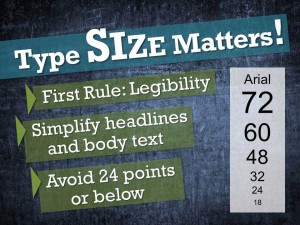
What is the correct size for type on a slide? How big should a headline be? What is the minimum size you can use for body text?

For those unfamiliar with design basics these are difficult questions. The simple (and flip) answer is “whatever works.” That doesn’t help very much. Here are some of my guidelines:

  • Legibility is the critical concern. Can your audience clearly see and easily read your slide from the back of the room? How often have I heard a speaker apologize, “I know that you can’t read this but…?”  Don’t ever put yourself or your audience in that position.
  • Be sure that you take into account ambient room light, screen size, distance to back of the room and age of the audience. If possible test your slides in the actual room conditions first.
  • Don’t be afraid of big bold headlines and spare, keyword-based text. Legible type size becomes easier if your slides are lean and simple so that they support your verbal content and don’t dominate it.
  • Avoid type at the lower end of the size range. If you need 24-point text you probably have too much type (and content) on that slide. Editing is called for.
By |2018-12-07T19:38:39+00:00February 17th, 2018|Daily emails|Comments Off on Type size matters

My 8 Best PowerPoint Hacks (5-8)


Hopefully you have found the first 4 of my favorite PowerPoint hacks useful to help you create top-notch presentations. If you want to see them again here they are here.

The remaining 4 are below:

  1. Move items between layers. Many PowerPoint users don’t know that the program builds slides based on layers. You can easily move elements between layers by selecting FORMAT > BRING FORWARD or FORMAT > SEND BACKWARD.
  2. Semitransparent shapes. This is another of my go-to techniques to separate text or graphics from a confusing underlying graphic. You simply place a rectangle or other shape between the top layer and the background. Move the shape between the correct layers by using the FORMAT > BRING FORWARD or FORMAT > SEND BACKWARD described above. The cool effect of this is to make the in-between layer semitransparent. Select the shape and the select FORMAT > SHAPE FILL > MORE FILL COLORS. The pop up allows you to select a color plus there is a transparency slider at the bottom. I generally prefer white or black and I start experimenting at 30%
  3. Make minor corrections to images without photoshop. If you have imported an image and it needs a little contrast or lightness tweaking use this: FORMAT > CORRECTIONS. You will be able to select from a range of contrast and brightness options without needing to edit the original image.
  4. Video setup slide. It is not uncommon for presenters to be surprised when they click the next slide and suddenly, they are in the middle of a running video before they have had a chance to verbally set it up. To solve this, I create a still from that video and paste it into a slide just before the video. Then when the speaker gets to the slide with the still they know they should introduce it and they know the next slide will be the video itself. Create the still this way: Run the video and then create a screen grab WINDOWS KEY > PRT SC. Then paste it into another slide ahead of the video slide.

Enjoy.

By |2018-12-07T19:38:39+00:00February 10th, 2018|Daily emails|Comments Off on My 8 Best PowerPoint Hacks (5-8)

My 8 Best PowerPoint Hacks (the first 4)

I spend a lot of time in PowerPoint. Over the gazillion hours I have invested in trying to get this somewhat frustrating program to behave I have discovered some tricks and techniques that help me get to where I need to go. Some are techniques that most people are not aware of, some are workarounds for things the brilliant minds at Microsoft seem to have forgotten. Here are the first four of my favorite eight.

1. Setup slides for screen size, audio and video. Before your audience ever walks in, you should test everything. These 3 slides will help you head off some nasty and embarrassing snafus especially if you are using a different computer than the one your deck was created on.

  • The first is simply a slide with a black rectangle filling the entire slide. There is a medium thick white border around the rectangle. Add 2 similar white lines to make an “X” in the center of the slide to help you focus. This is my first slide. It helps me focus and frame the projector and screen if it is a portable setup.
  • The second setup slide is simple a copy of any slide that has an audio embedded in it. I want to check the sound hookups and levels to make sure my audience will be able to hear it clearly without it being too soft or loud.
  • The third setup slide is a copy of any slide that has a video embedded in it. If there is more than one video make a copy of each slide and test each one. Many systems do not have all the necessary video drivers. Best to know that before you start.
  • While you are running through these setup slides before your big performance why not go through the entire presentation and look for strange formatting and font substitutions.

2. Avoid reformatted slides from another slide deck or computer. One of PowerPoint’s most frustrating problems is that when you are copying slides from one deck to another it reformats your slides to conform with the new theme. You can head this off by using the PASTE > KEEP SOURCE FORMATTING command. You can access it with a right mouse click as you paste or HOME > PASTE > down arrow > KEEP SOURCE FORMATTING.

3. Avoid font substitutions – use “paste as graphic.” PowerPoint does not play nice with fonts. If you transfer your deck to another computer your non-standard or decorative fonts will not go along for the ride. There are two solutions. 1) Go to FILE > OPTIONS > SAVE. Scroll to the bottom and select EMBEDDED FONTS IN FILE. This will embed your TrueType fonts and they will be available on other PCs. They will not be available on Macs.

Another solution is to copy the shape your decorative text is in to the clipboard and then right click > PASTE as PICTURE. The text will now be a graphic and will copy to any other computer. NOTE: You will not be able to edit the text once you have converted it so be sure of what you want. (You can also keep a copy of the live text in the margins on the original computer in case you have to go back and change something.)

4. Use glow to separate text from background. I love to use full screen images and photographs for their powerful effect. When I want to overlay type on that image it can be hard to read. One solution is to put the type in a rectangle or other shape with a suitable fill color. Another very attractive technique is to create a glow effect behind the type (you can do the same thing with a graphic). Select the shape the type is in and then FORMAT > TEXT EFFECTS > GLOW. Scroll to the bottom of the pop up and select GLOW OPTION. Then play with the various options and colors to see the best effect. I usually default to a white glow.

There you have it — the insider scoop. Now, hopefully you will still have some hair on your head after wrestling with PowerPoint. It is too late for me.

By |2018-12-07T19:38:39+00:00January 28th, 2018|Daily emails|Comments Off on My 8 Best PowerPoint Hacks (the first 4)

Ugly babies

Ugly babies

Just about every client presentation I ever worked on (and most of my own) was simply awful when it was first born. It is a phenomenon termed “Ugly Babies” by Ed Catmull, President of Pixar, in his wonderful best seller, Creativity, Inc.

“They are truly ugly: awkward and unformed, vulnerable and incomplete. They need nurturing — in the form of time and patience — in order to grow.”

Often our early presentations are bloated with too much information, they are unfocused and they wander around their content with no understanding of what the audience can connect with.

The process to turn them into a first-class presentation requires a number of things:

  • Confidence in your message — the understanding that with the right care and feeding this will become a worthwhile presentation
  • Willingness to edit. There is only so much an audience can absorb. If you want to tell them everything, write a book. Otherwise distill your ideas down to simple nuggets of truth and deliver them powerfully.
  • Persistence. Creating a presentation worthy of your audience and your message is a process. Keep plugging away. Edit, edit and then edit some more. Get some first class feedback and then edit again. It will get better, slowly.

Realize that good presentations take work. Your newly born “ugly baby” might actually be quite beautiful when you look ahead to what it can someday become. You must be willing to be patient and keep working to make it spectacular.

By |2018-12-07T19:38:40+00:00January 6th, 2018|Daily emails|Comments Off on Ugly babies