/Daily emails

Learning from Mad Men: Set the stage for your visuals

Mad Men Carousel

A great strategy for beginning a visual presentation is to open with a simple verbal narration. Use your words alone to set the stage for the message to come. Then, when you have properly prepared the audience, start your PowerPoint presentation. It is a dramatic technique that keeps the focus on you instead of your visuals.

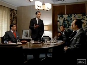
In this clip from the long-running AMC television drama Mad Men, Don Draper, the brilliant 1960s advertising executive, is pitching representatives from Kodak. He is introducing them to his term for their new slide projector based on the wheel. As the executives settle into his office, Don is in no rush to get them to his slides — the equivalent of a 1960s PowerPoint deck. Instead, he begins with a story of his early days in advertising and how the concept of “new” and “nostalgia” can have such a powerful pull when delivering a message.

Only after he carefully sets the stage with a call to his audience’s emotions does he turn on the projector and begin a narration through his slides. Finally, after continuing to build the emotional pull with a series of warm and fuzzy family images, he introduces the term “Carousel” as the name for Kodak’s new product line. The image of the projector and the term “Carousel” are only on the screen for about 2 seconds. Yet the message is incredibly powerful and clear.

He has created the perfect verbal setup and then lets the slides serve to further illustrate and carry home the message. A different but very effective delivery strategy.

Watch the Mad Men clip here.
By |2018-12-07T19:38:33+00:00June 3rd, 2018|Daily emails|Comments Off on Learning from Mad Men: Set the stage for your visuals

5 seconds to “get” your slide

You've got 5 seconds

A commonly cited number that visual presentation and PowerPoint trainers use is the 5-Second Rule (if you have A.D.D. it may be the 3-Second Rule). It simply states that your audience should “get” your slide in that short amount of time. You can liken this to the experience of trying to read a billboard as you zoom by at highway speeds — you need to get it quickly and then return to the task of driving or risk disaster.

Why so urgent a need to absorb a visual? It is simply this: there are countless ways for your audience to be distracted from you, the presenter; having overly complex slides is just adding fuel to that fire. I see the 5-Second Rule as more of a guidepost. Of course there is just cause for more complex slides that will hold the viewer’s attention. But the longer they are engaged in the task of deciphering your slide the greater the chance they will not completely return their focus to you.

There is also a point of over-saturation as well, only so much material can be absorbed from a slide. Adding more detail does not guarantee it will be understood.


Keep it simple, please — add complexity at your own peril.


By |2018-12-07T19:38:34+00:00May 12th, 2018|Daily emails|Comments Off on 5 seconds to “get” your slide

Before and After: Training Visuals

Before and After

Before and After: Training Visuals

This original slide was created for a presentation that would suggest ways an insurance sales professional could engage a customer in some friendly small talk. The instructor would simply read the text on the screen to his workshop attendees — a very ineffective way to begin a conversation about the topic.

Let’s see what was done to enhance this slide:

  • Although the other slide redesigns in the deck are not shown, an overall background and style had been established. The headline typeface and style were chosen to suggest a friendly, casual but still professional format.
  • The layout and the textured blue background are consistent with the “look” of the other slides in the redesigned deck. The blue coordinates with the corporate colors and with an overall business feel. This slide is intentionally not a template — there are other, varied but compatible layouts at various points in the presentation.
  • The text has been greatly reduced to a few talking points so that the attendees can be encouraged to participate in a discussion rather than just passively listening as the presenter reads the slide.
  • Finally, some high quality stock “slice-of-life” images were included in a scrapbook format that would suggest a client’s cherished family photo memories.

Overall, the redesign gives a very professional but informal air to the presentation while still guiding the presenter to cover the necessary topics.

By |2018-12-07T19:38:34+00:00May 6th, 2018|Daily emails|Comments Off on Before and After: Training Visuals

A slide to set up your projector

Part of preparing to give a sharp, professional presentation is attending to the details. Certainly on your checklist should be how you set up your projector and whether or not you make sure your slides fit on the screen appropriately. It may be a small thing but making sure your images are the right size, squared up and in focus is a subtle message to your audience that you are the real deal.

This almost blank slide can help you set that up. It is simply a first slide that has a full frame black rectangle with a white border and some text. Project this slide when you are setting everything up. Do you see all the white frame edges? Is it rectangular or do you need to adjust the distortion up and down or left and right (keystone effect)? Do you have optimum zoom and focus? If this slide projects well then you know all your slides will be sharp and fit on the screen without being distorted or cut off.

You can then advance to your real first slide and be ready to stand and deliver.

By |2018-12-07T19:38:34+00:00April 15th, 2018|Daily emails|Comments Off on A slide to set up your projector

If you must read your slides from the screen

If you must read your slide from the screen

Sometimes it make sense to read a short burst of text directly from the screen. Some examples: a critical quote, a mission statement or a small clip of words that you want your audience to absorb just the way they were written.

Here is a technique to enhance the experience of reading from the screen:

  • Pause when the slide is first projected long enough to let your audience “get” the slide and read through the quote or text.
  • Then read the text slowly and dramatically as per your personal style.
  • Additionally, you could introduce the slide with a simple statement like, “Let’s take a look at an important point of view from (name) on this subject…”

Since your viewers will be done with their reading, your dramatic oral recitation will add to their understanding and retention.

By |2018-12-07T19:38:34+00:00April 5th, 2018|Daily emails|Comments Off on If you must read your slides from the screen