Let handouts carry the details
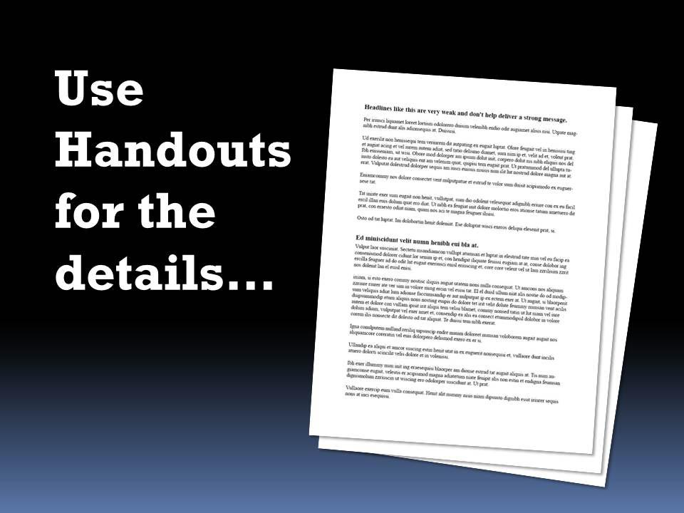
Handouts are a speaker’s ace in the hole. They are an effective solution to the dilemma of how to deliver large amounts of information to an audience without overloading or boring them into a coma. If done correctly they are a valuable resource in the speaker’s toolbox, especially for those who must deliver detailed content to their audiences. Engineers, medical personnel, scientists, teachers or just about any presenter that is called on to offer more than just the basic “3 points and a conclusion” will find great value using handouts.
The reasons for this can be found in the senses and the tools we, as humans, use to assimilate and retain information. We are built to respond to the spoken word the way we are to stories that our distant ancestors told around the campfire. We want to capture the salient point from the story – what is the one lesson about great hunting grounds or dangerous rivers that we need to know and how important and believable is it? We do not have the depth of memory or the attention ability to take in and retain large amounts of data via the spoken word – we just want the highlights.
Our visuals have a similar shortcoming. We respond to images the same way: we see an ad in a magazine or a scene in a movie and we want the quick takeaway. What do I need to learn from this? What’s the main point and how can I best use it.
In essence live speakers and their visuals both have this same inefficiency: they can build interest and passion for their big idea but they are ineffective when called on to verbally provide the 20 ways to market your business or the step-by-step recipe for banana nut bread. For these types of details we need to read.
Reading, whether on paper or on a digital device, can deliver dense knowledge to the brain in a different way. Since we first learned to read we used it to absorb detail. Long lists, involved concepts and detailed procedures just like the subjects we studied in grade school and college are best packaged and delivered though a medium that we can scan as fast or as slow as we wish — one where we can “rewind” and go back over the material, even months later if needed, for retention. Reading text or absorbing detailed charts and graphs is most efficiently done using printed and distributed materials – for the speaker that means handouts.
Use handouts to provide the details while you deliver the key points and takeaways plus the emotion from the stage.
When to handout the handout
Handouts given before the speech should have a specific purpose and be kept short and to the point. Anything detailed can be a great distraction when offered in advance or even during your presentation. The rule, like so many others in the presentation world, is to do it for a purpose. Simply put, ask yourself this question: “Does giving the audience this handout at this time help the audience understand the points I need to deliver? Or will it distract?”
Prior to the beginning of your speech or training session you may want to handout a branded bio of you or your company to establish your credibility. It could be useful to put a questionnaire or short written piece in your audience’s hands that will wet their appetite or get them to begin thinking about your subject – a warm-up of sorts. But I would caution against too much detail prior to your delivery – especially for a shorter (less than one hour speech). Give them something they can scan and digest quickly so that they can focus on your presentation when it is offered. If you give them a 20 page handout listing and discussing the research behind your findings you will fight for their attention throughout the speech. Some of your audience might even form preliminary and possibly inaccurate opinions and will tune out for your big performance.
For longer programs, such as half- or full-day training sessions or workshops, it may be appropriate to distribute worksheets and workbooks that cover extended amounts of your material in advance. But it may also be useful to offer specific worksheets or other material at the time it will be used.
During the presentation handouts can fill a few important roles. Speakers might give out a worksheet for an interactive exercise or to provide background information for a specific topic at the time it is discussed. Offering that information in a handout prior to when it is delivered could be distracting or it could dilute the effect of focusing attention on the topic precisely when it is going to be presented.
Handouts given out during the presentation can also have the positive effect of breaking up a speech, offering a physical as well as mental change of pace. It can be a great way to transition into a new subject area or activity.
Weigh the cost of interrupting your delivery with a mid-presentation handout against the value of these positives. The shorter your speech or training the more disruptive it will be to stop and distribute paper or printed material.
One additional option: consider assigning a volunteer the task of quietly passing out materials at a time of your direction.
After your presentation is when handouts can have the greatest value. As a takeaway they can package your promotional and branded material to establish your expertise, continue contact with your audience and solicit further business. They can provide detailed background or research data that can help establish your credibility and provide your audience with additional useful information. And a post presentation handout can list links and reference sources for further information.
The importance of well-crafted handouts.
Some seasoned speakers create professionally designed handouts with the same attention that they might use for promotional materials. Your budget and time restraints might not allow this. However, I would encourage you to put some effort into it. There is a subliminal effect when someone picks up a thoughtfully created printed piece – it tells them in a subtle way that they are dealing with quality. A sharp-looking handout will subconsciously establish you as more of an expert or thought leader than a poorly produced flyer would.
Follow along and fill in the blank
A valuable technique many presenters and trainers use is to have audiences follow along in a handout or workbook as they work through a fairly detailed procedure or thought process. Their slide deck can have similar material (perhaps just the outline form) so that a viewer can match what they are hearing and seeing with what they are reading. There is an important distinction here though: Do not read your content either from the handout or from the slides word for word. This is the deadliest of presentation sins. Paraphrase, offer a different view of the material, condense it into appropriate comments but don’t read it. Your audience can do that for themselves.
Having audiences fill in the blanks in a handout or worksheet accomplishes a similar goal – that of working through a step-by-step idea or process. This type of exercise has the added benefit of requiring the audience to physically and mentally stay engaged to complete the important points you want them to remember. Filling in a worksheet like this might be an effective way to have the audience apply a principle that you previously discussed.
Handout Summery: Ask yourself these questions:
- Do I have extensive details that cannot be effectively delivered orally or on short, to-the-point slides?
- Is there background or branding material that I want my audience to have before they hear me?
- Will the handouts I have be a distraction for my audience?
- Are there details that the audience needs at a particular point during my presentation?
- Do my handouts reflect the quality image I want my audience to perceive about me and my organization?
Don’t be afraid of big fonts
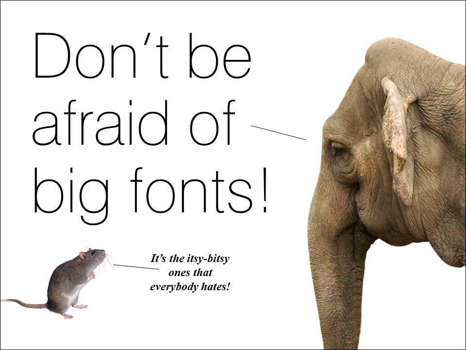
In general, the defaults and templates that ship with PowerPoint and other programs are meek and mild in the font size department. Go bold and use large, short headlines to introduce your ideas. Once you begin to use keywords instead of complete sentences or (gasp) paragraphs in your bullets you can enlarge those words for maximum effect.
The value of good slides (or how I justify my obsession with PowerPoint)
I often get a prolonged silence when at various social events I recite my response to “What do you do?”
My reply: “I create visuals for presenters, a.k.a. PowerPoint.” is enough to stop a conversation right there. If I am at a party, that usually signals the time for more liquor or perhaps a trip to the rest room.
I have long given up the need to defend my craft or to explain that what I do is not the usual image of corporate PowerPoint but rather a way of coupling an impactful visual with equally powerful words from the presenter. I see it as an opportunity to multiply the effect and the memory of a live presentation. But is that just so much talk or are there really benefits to having slides projected behind you when you stand and deliver?
From my experience there are concrete benefits and I will list a few here:
- The right visual and the right words dramatically improve the power of your message and the short- and long-term recall. There have been legions of behavioral studies that establish this link. A few words plus an image works. The words can tell the story and the image adds a visual clue that the mind can use to add meaning to the concept. My own experience forces me to concede that this effect requires the right words and the right images. It is not an automatic – they must complement each other. And an endless parade of images will certainly dull the effect of that one key concept you want to burn into your audience’s collective memories.
- Visuals can provide a background for the presenter to perform before. They can be a stage providing general reminders of what is being discussed. There may not be a need to be specific. Let your words elaborate and let the visuals add to an overall effect.
- Top quality graphics can certainly establish the professional caliber of the presenter. They will set you apart from more amateurish or unprepared presenters. Additionally, like a well-tailored suit, well-designed slides speak to your attention to excellence without having to actually announce it.
- Let’s not forget the most basic of functions: to illustrate a concept, process, physical arrangement or any other complex idea. Sometimes a picture is worth that thousand words when you can show that this goes here and then that goes there.
- Finally, slides can be a confidence boosting set of subtle cues that can keep a presenter on track and remind him or her of the things that must be covered in their proper order. The danger here is, of course, that we will put too much on the slides to remind us of what to say and then – gasp – turn and read it, word for word, to our audience. The visuals should cue us without being obvious and while still bringing useful information to the audience.
There, run for a drink if you have had too much justification for my career in PowerPoint. When we meet we can discuss the weather.
