/Daily emails

A useful animation to show motion

A useful animation to show motion

Nine times out of ten, animation works against the goal of the presenter: to deliver a clear, effective message. Most uses of PowerPoint animation are the “gee-whiz” variety — meant to look flashy without any useful purpose. When we create slides we can be like the sorcerer’s apprentice playing with all of the master’s secret, cool magic tricks. Trust me, neither you nor I will ever be as good as even the cheesiest children’s cartoon show. Your audience will not be impressed and most likely they will find it very distracting.

What we can do is use modest animation that serves a specific purpose.

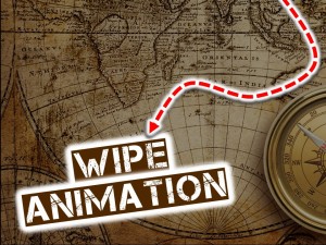
The animation in this example is a simple “wipe” animation that reveals a graphic element, in this case the arrow, from one end to the other. It shows motion against a map and leads the eye to the words as they are revealed.

Two ideas to keep in mind:

  1. More is usually less. Keep your animation on the subtle side.
  2. Experiment with the timing and how the animation will start or be triggered (On Click, With Previous and After Previous).

I generally coach people to forget the fancy stuff but, in the right spot, a little animation can be a good thing.

Watch the animated slide here.
By |2018-12-07T19:39:46+00:00January 11th, 2015|Daily emails|Comments Off on A useful animation to show motion

Ditch the title slide

Ditch the title slide

Quite often there is no need for the title slide.

If you have been properly introduced; if your talk is listed in the program; if the email told everyone what the meeting was all about; if your presentation is focused and doesn’t wander around ten vague ideas — then ditch the title slide. OK, if you must, replace it with just a title word or two to help generally define the subject. Maybe add an appropriate high quality image as background.

Or just start. Get to it. That’s why we are all here anyway.

By |2018-12-07T19:39:46+00:00August 25th, 2014|Daily emails|Comments Off on Ditch the title slide

PowerPoint can make you rich

PowerPoint can make you rich

Somewhere on the web it states that there are 30 million PowerPoint presentations created daily. Now I haven’t seen them all but I can tell you with a fair amount of certainty that perhaps 95% of them are horrible: text-heavy slides, vast wastelands of number-filled charts and presenters that rely on reading the slides as if it were a 3rd grade book report.

Businesses are not going to stop using PowerPoint just because we abuse it. It is the standard for business presentations in government, schools, military, industry, non-profits and even houses of worship — around the world!

This smells like an opportunity to me. The standards are so low that if we  just but push out of the norm a little we can stand far above the crowd. It won’t take much. Maybe if you just get the full sentences off the screen and stop reading the slides you will become a legend, a presentation superstar.

You peers will hoist you to their shoulders, carry you to the boardroom and demand at least a tripling of your salary. You will be on all the talk shows. Oprah will love you and little children will ask you for your autograph.

You will become rich beyond measure. Just please stop reading the danged slides.

By |2018-12-07T19:39:47+00:00June 1st, 2014|Daily emails|Comments Off on PowerPoint can make you rich

Add images to those dry charts

Most Popular Fruit

PowerPoint loaded with heavy text slides and dry lifeless charts — what could be more boring? One way to make a chart more engaging and more colorful is to add images. Use images to build the graph or as a background or to create a border. Use top quality photos and artwork to look professional and add some snap to those dull graphs and charts.

It will elevate you entire presentation.

By |2018-12-07T19:39:47+00:00May 18th, 2014|Daily emails|Comments Off on Add images to those dry charts

Open with a professionally produced intro

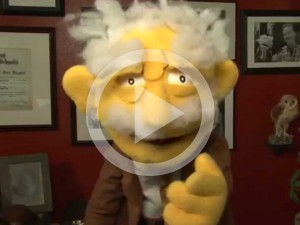
Prof. Has Von Puppet

Video is easier than ever to incorporate into your PowerPoint presentations. I spent a good deal of money ($5) on this video from Fiverr.com and use it to introduce myself at some of my workshops. For the right casual audience this is just the thing.

It shows how a little creativity and a little money can turn a presentation into an experience.

View my intro video here.


By |2018-12-07T19:39:47+00:00March 23rd, 2014|Daily emails|Comments Off on Open with a professionally produced intro