/Daily emails

A quick fade

A Quick Fade

Animation in PowerPoint or Keynote is a very slippery slope. It seems that the average user cannot resist the urge to fly in text or spin transitions from one slide to the next. Additionally, they must feel that once is certainly not enough — the stunning effect has to be repeated dozens, if not hundreds of times.

The average audience member doesn’t quite see it that way. The zooming and flying quickly becomes amateurish and nauseating for your viewers. I generally coach anyone but an experienced designer to avoid all animation. Except one: the quick fade.

This simple effect fades one slide out as another fades in. Or fades in and out text or graphic elements. I usually reduce the timing to half of what the default is — usually .25 seconds. That is just enough to soften the entrance, exit or transition process but not so much that it is noticeable and repetitive. It should almost be invisible.

You can use quick fades to give your performance a subtle and professional touch. Avoid the gee-whiz stuff — leave that to the pros at Pixar.


By |2018-12-07T19:39:33+00:00March 20th, 2016|Daily emails|Comments Off on A quick fade

An image plus a few words

Image plus a few words

Big bold images in a slide can make an effective backdrop for presentations. Not only are these graphics exciting and engaging, they can be seen and understood quickly so that the audience can keep their focus on the presenter and his or her comments.

This images are also general enough that the speaker can steer the discussion to whatever direction and depth seems appropriate for the occasion. But general images can also be wide open to interpretation — possibly leaving the audience a little distracted as they try to understand the direction of that particular section of the presentation. Adding a few well-chosen words to the image can help narrow the context and give the audience a frame in which to understand and assimilate the presenter’s words.

Listeners will appreciate the guidepost and will be able to keep their attention where it belongs: on you the speaker.

By |2018-12-07T19:39:34+00:00March 13th, 2016|Daily emails|Comments Off on An image plus a few words

Begin with the end in mind

Begin with the end in mind

Stephen Covey, in his groundbreaking 1989 bestseller The 7 Habits of Highly Effective People (Free Press), urges readers to begin with the end in mind (Habit 2). Speech coach Jim Dawson brought this to mind recently as we discussed techniques used to conceive and create an effective presentation. It seems simple: to know where you want to be at the end of the presentation — what you want to deliver. But so often a speaker’s destination is vague and broad. The speech wanders aimlessly along an unspecified path and ends weakly.

Spend time at the very beginning of the conception process to carefully define exactly where and how you want to end. What do you want the audience to take away? Can you express it in less that 20 words? Less than 12?  What do you want them to remember a week later? Make it short, powerful and memorable. Then go back and work on the beginning and middle.

Use that carefully defined goal as a yardstick to measure everything against as you write your speech and then as you create and edit each slide.


By |2018-12-07T19:39:34+00:00March 6th, 2016|Daily emails|Comments Off on Begin with the end in mind

Don’t squish their heads

Don't squish their heads

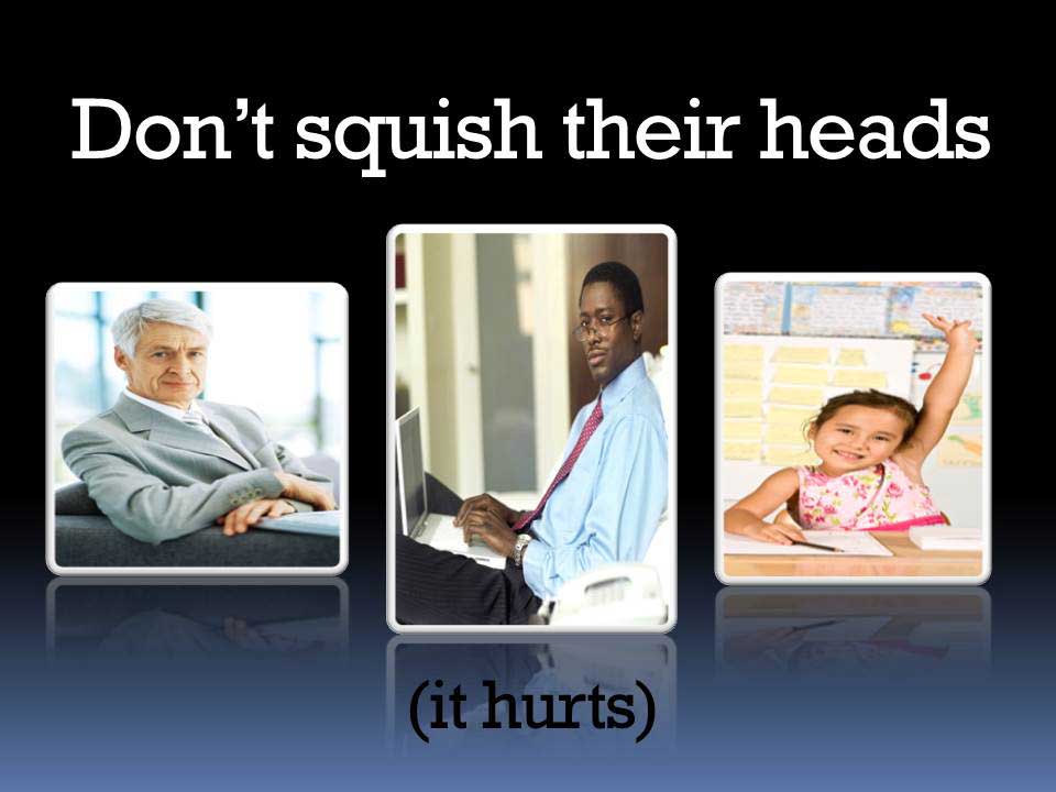
I don’t know if this bothers anyone else — maybe it is just me and my graphic design touchiness. But it makes me crazy when I see distorted images — photos of people and objects (like a basketball) that have been stretched or crushed to make them fit a space. It can be seen all the time in slide decks designed by folks who should know better.

The human eye and brain are very aware of even the slightest of these amateur short cuts and that is just what it looks like — amateurish.

There is an exception of course, you can stretch my photo out just a little to make me look 6′ 2″ and to help me lose those extra pounds…


By |2018-12-07T19:39:34+00:00February 28th, 2016|Daily emails|Comments Off on Don’t squish their heads

Shadows can make your text stand out

Shadows can make text stand out

There are dozens of ways to overlay text onto a potentially confusing background. A subtle yet effective technique can be to add a “drop shadow” to the text. That is simply a software-added effect that makes it appear that there is a light source casting a shadow from one element (the text) onto another (the background).

In PowerPoint there is a simple command in the font menu that will accomplish this. However this is usually not strong enough and the parameters of the effect must be tweaked to create maximum legibility.

It may not always work, but your first attempt might be to use a shadow to separate confusing elements. Just make sure to judge the overall effectiveness from the audience’s point of view.

By |2018-12-07T19:39:35+00:00February 17th, 2016|Daily emails|Comments Off on Shadows can make your text stand out