/Daily emails

You can only deliver so much

You-can-only-deliver-so-much

A live, one-to-one or one-to-many presentation can be the most powerful and motivating form of business communication available in today’s noisy marketplace. Done well, a speech can move your audience to adopt a new point of view or take on bold actions. But presentations have their limits — a major one being that you can only deliver so much information from the podium or in front of the room.

To maximize the effect of a presentation there are as many strategies as there are presenters, but a common formula is to have one overriding idea, supported by approximately three points. Those three supporting ideas can have deep or shallow content depending on the speaker, the occasion and the audience. The concept is that there is one idea or goal and that everything drives the presentation towards that goal. This is a highly workable plan.

If you try to deliver ten separate ideas or one idea with 10-20 supporting points you are diluting the message not reinforcing it. Keep your content well aimed, use two to four of your most persuasive arguments and then finish up. Your audience will appreciate your focus and will thus have a good chance of getting your message.

By |2018-12-07T19:39:21+00:00May 28th, 2016|Daily emails|Comments Off on You can only deliver so much

Always use a headline (almost)

Always use a headline

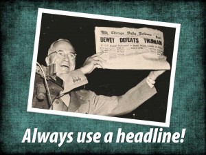
Headlines help the viewer understand where they are, what is being presented and why they should care.  They are often the most frequently read text on any slide. They draw the eye and the attention of the viewer and show them where to begin. And, they are the easiest way to keep your presentation on track and focused. Yet headlines are considered optional or are forgotten in many of the slides and presentations I have seen.

Some random thoughts:

[list style=”orb” color=”blue”]
  • Make your words important. Headlines are such powerful tools because they can have such a powerful effect. Use strong words, in an active voice, that reveal a benefit, show a focused point of view or move your presentation towards its goal. Avoid the wimpy!
  • Tell your audience what they are about to see. Help them decide that it is worth their while to pay attention to this slide and the rest to come.
  • Short and sweet is best. Edit down to the most basic, and most potent, content.
  • Bigger is generally better. Don’t be afraid of using large, bold fonts. Strong words deserve a strong display.
  • If you are intent on using an unusual or decorative font to tell your story, this is your chance. Be sure that the “look” of the font fits with your presentation and that your audience can easily read it.
  • All caps can be OK in a short headline. Using all capital letters can make a big statement — just make sure the effect is legible.
[/list]

Always use a headline? Well, never say never. There are probably a few situations where an individual slide may not need a headline, I just haven’t seen too many of them.

By |2018-12-07T19:39:22+00:00May 21st, 2016|Daily emails|Comments Off on Always use a headline (almost)

Everything you knew about PowerPoint is wrong

Everything you knew about PowerPoint is wrong

[list style=”orb” color=”blue”]
  • PowerPoint is not the cause of boring meetings. People are the cause of boring meetings.
  • PowerPoint is a visual medium like TV or cinema. Don’t fill it up with words.
  • PowerPoint can be a very effective way to connect with your audience – use words plus images.
  • Childish animations and free clip art don’t make you look cool. They make you look like an amateur.
  • Data, by itself, is meaningless. Make sure your numbers deliver a message.
  • Your audience didn’t come to see your slides. They came to see and hear you.
  • Improve your PowerPoint skills and you will be a business rock star.
[/list]
By |2018-12-07T19:39:24+00:00May 15th, 2016|Daily emails|Comments Off on Everything you knew about PowerPoint is wrong

Using a graph? What’s your point?

Charts

Presenting data to an audience is a challenge. If we just dump a pile of numbers on the screen we can expect those “eyes glazed over” looks that PowerPoint is so famous for. To make numbers meaningful we often turn to a graph or chart to show numbers as visual relationships.

Unfortunately, PowerPoint is all too ready to help us make those many layered, three-dimensional, color coordinated graphs that are just as confusing as the raw data. As the “tour guides” of our presentation we need to simplify and clarify or maybe even interpret the essential meaning of our numbers for our audience.

Determine the single concept that you want the data to show for this slide. Extraneous data can be reduced or eliminated. If you are concerned about “dumbing-down” your presentation, show the entire dataset — display it in a chart and then quickly move to a simplified chart or graph that makes your point as clearly as possible. Or better yet, tell your audience that the raw data will be available in a handout after the talk.

It is our job as presenters to make all the information we place before our audience meaningful. Keep your graphs simple and to the point.

By |2018-12-07T19:39:30+00:00May 7th, 2016|Daily emails|Comments Off on Using a graph? What’s your point?

Are your slides as good as you are?

are-your-slides-as-good-as-you-are

You have spent years becoming the best at what you do:

  • The best expert on nasty intestinal diseases.
  • The best salesperson in the world selling amalgamated toaster levers.
  • The best leader of an international toilet paper company.

But when you stand in front of your adoring fans and deliver a high-stakes presentation, do your slides … suck?

If you are like just about everyone else in this situation your slides are your weakest link. Bad slides make you look amateurish, unprepared or simply dumb. We have all sat in those endless presentations and watched the parade of overflowing text, silly grade-school graphics and mind-numbing data-sets. Fortunately, that is fixable!

Imagine your next presentation: You step in front of your audience, your peers, or your potential clients. Each well-designed slide adds to the deep meaning and understanding of your listeners. The visuals look professional. The data, without being “dumbed-down,” makes your point brilliantly.

You are a rock star.

That’s what we do. We make great presentations happen. For you.

We make your slides as good as you are.

By |2018-12-07T19:39:30+00:00May 1st, 2016|Daily emails|Comments Off on Are your slides as good as you are?