/Daily emails

Before and After: Opening slide makeover

Opening-slide-makeover

Business presenters often have that nagging feeling that their slide deck is weak but they don’t know where to start the rehab. This week’s slide begins at the beginning — the opening or title slide.

Opening-slide-makeover-beginning  —>  Opening-slide-makeover-finish

This original (left) is a remake of a slide presented by a client. It is a good example of how a heavily designed template coupled with the default type and sizes can lead to a weak slide — a bad way to start any presentation. The goal of an opening title slide, if used, should be to help the the audience identify where they are going and how interesting that trip will be. They want to feel that their attention will be well spent. The original shows the rather distracting graphics and branding of the template coupled with the weak default type style and size for the headline. Not too exciting.

For the remake I wanted to make this opener more powerful and engaging. I made the headline large and inviting and then created a hierarchy of text, logos and graphics to support it. Now the audience can easily get the importance of this presentation and whether or not they want to be there.

Step-by-step changes:

  1. I increased the size of the headline, made it a heavier typeface (Arial Black)  and moved it to the top of the text area.
  2. A bold, but smaller subhead was added that helped identify an audience benefit.
  3. The target audience’s logo, Aveinia Organics, was enlarged and moved below — a logical progression for the viewer.
  4. The color swirls were spread to allow for more white space in the center area.
  5. Next, I lowered the intensity of the graphics using a white box overlaying both the blue and green swirl. I set the transparency to 30% or so in the Shape Fill menu in PowerPoint.
  6. The Workflow Analytics logo was moved up and over to a more subtle and balanced position.
  7. Finally, I sampled a color from the lower swirl and applied it to the headline to help tie everything together.

When you use an opening slide, make it work to quickly engage the audience and build their excitement for the trip you will be taking them on.

One small warning: In a corporate environment be sure you are comfortable with pushing the rules and limits of branding guidelines. Some organizations will hold fast while others will allow for some flexibility. Check it out first.

By |2018-12-07T19:39:18+00:00June 30th, 2016|Daily emails|Comments Off on Before and After: Opening slide makeover

Videos and the impatient audience

Impatient audience

More and more, all of us are becoming conditioned to rapid scene changes, fast-moving action and quick, easily digestible content. As presenters we must be aware that our audiences will increasingly demand short, bite-size pieces of information.

One of the ways that we can do this is to offer drastically edited video clips. For some reason, even a well produced four minute video, when presented as part of a PowerPoint deck can seem to drag on at a glacial pace. I was recently asked to include a very well-done product video at the start of a speech. The clip at four minutes was way too long to show as part of a live presentation. I could almost see the yawns after the first 90 seconds or so. We trimmed it down to one minute and even that seems a bit much.

I am not sure why a live presentation demands this type of super short video but it does. Edit away all but the essential information, keep it as short, fast moving and to the point as you can.


By |2018-12-07T19:39:19+00:00June 26th, 2016|Daily emails|Comments Off on Videos and the impatient audience

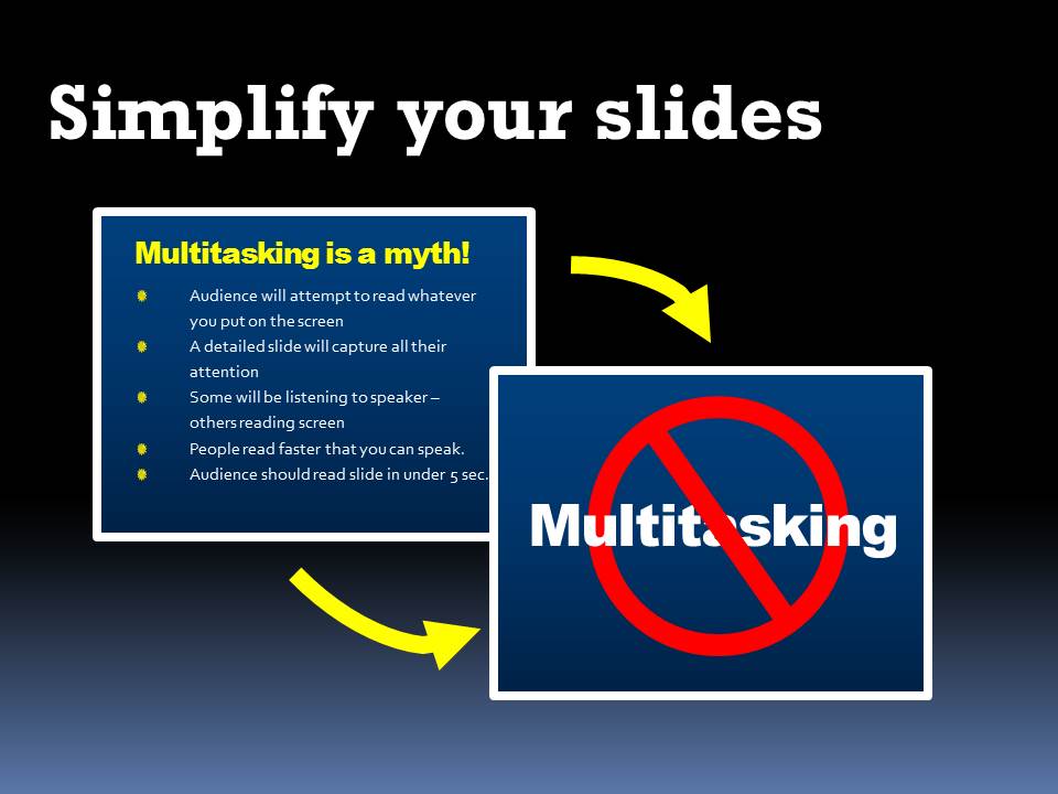
Simplify your slides

We’ve all sat through the endless presentation when a speaker will read full sentences direct from his visuals. An effective way to avoid inflicting this horror on your audience is to reduce your concepts to keywords or a symbol. Then you, as the speaker/expert, can enumerate whatever details are appropriate at the time from the podium.

A cautionary note: a technical audience may not appreciate oversimplification or “dumbing-down.” If details are critical consider putting them in a handout that they can take away later. This keeps the focus where it belongs on you, the presenter.

By |2016-06-19T23:59:42+00:00June 18th, 2016|Daily emails|Comments Off on Simplify your slides

Intellectual property

Intellectual property rights

Can I use Google images for my slides? Can I use an image someone sent me? Can I use an image from one of those free wallpaper image websites for my company presentation?

The short answer to all those questions above is “Only if you want to get a nasty letter from a lawyer.” Intellectual property rights are about as confusing a subject as my poor old brain can handle. But, the simple rule is this: If someone else created it, then they own it, unless they specifically give it or sell it to you.

There is a concept called “fair use” that allows you to use other peoples work without acquiring permission. According to Wikipedia, you may cite another’s creation for things like commentary, criticism, parody, research, teaching and scholarship. A few cautions though:

[list style=”orb” color=”blue”]
  • Only use small amounts of someone else’s material
  • Cite the original owner whenever possible
  • Never use unlicensed material for commercial or business use
[/list]

If someone else created it, they own it. There are plenty of quality, moderately priced stock image providers available. Remember, teams of lawyers are standing by, just waiting to write you a nasty letter.

By |2018-12-07T19:39:19+00:00June 11th, 2016|Daily emails|Comments Off on Intellectual property

Choosing backgrounds: Light or dark?

Light or dark

It’s the most basic design decision when planning a PowerPoint project: Light background or dark? Corporate presentations often have to conform to a specific company style or template. For many of us though, we have to confront the light or dark question at the beginning of the process. Some random thoughts:

  • The default seems to be a white slide with plain black text. (Add a plain black headline and a few bullets and we have that dreadfully boring look we have all come to hate.)
  • Many presentation experts will say that text against a light background is most legible in bright rooms while a dark or black background is best for darkened rooms. This may or may not be true — you will have to judge for yourself.
  • I personally like the dramatic effect of white or bright text against a dark background. If the text is large (it should be), there is not too much fine detail in the letterforms and there is enough contrast between the text and its background, legibility will not be an issue.
  • Finally, I find the large expanse of brightness from a light background to be distracting — unnecessarily drawing the audience’s attention from the speaker.

I often use full frame images and then overlay text, but when I use a consistent background throughout a presentation I generally choose dark or black.

Experiment with your next project and see.

By |2018-12-07T19:39:21+00:00June 4th, 2016|Daily emails|Comments Off on Choosing backgrounds: Light or dark?