Displaying a chart in business or technical presentations is often a battle between showing a table filled with the overwhelming raw data that was collected for a project or showing only the filtered data that is important for the attention of the audience. Here is a simple technique in PowerPoint I often use to accomplish both and thus sharpen the audience’s focus without “dumbing-down.” This table contains data downloaded from usgovernmentspending.com.
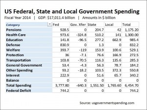 Slide 1 –> Slide 4

The goal is to first show the raw table (Slide 1) to establish the range of data and its source. Then to transition to the exact same table with only the data that is critical to our presentation — in this case the line listing the Defense Spending (Slide 4).
 Slide 2
Slide 2 shows the first step: Inserting white boxes (with a black border for clarity) covering the data we want to hide.
 Slide 3
Slide 3 show the results of selecting 30% transparency in the format > shape fill > more fill colors PowerPoint menu. I usually play around with this value to give the best effect. Be aware the white is an effective choice here but other colors may work better with different backgrounds and situations. This is all best determined by experimenting. I have also removed the black border for both boxes.
 Slide 4
Finally, in Slide 4 I have drawn a red border around the important line in the chart I want to discuss.
Slide 2 and Slide 3 are then removed. When presenting I display Slide 1 to establish the entire data set and then fade to Slide 4 to drill down to the numbers that I want to address.
This technique assures that the audience sees the whole data (not a “dumbed-down” version); then the bulk of the data is grayed out so that it does not distract; finally the critical information is highlighted to keep their attention.
