/Tom Nixon

About Tom Nixon

This author has not yet filled in any details.
So far Tom Nixon has created 302 blog entries.

If you show it, they will (try to) read it

If you show it, they will (try to) read it

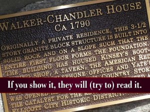
Watching a presentation lately I was reminded of a principle that is fundamental to how audiences might experience what we do. The presenter projected an image of an historical plaque. The text on the plaque was only slightly relevant to the subject. I, and I assume most members of the audience, read the first line or two and then gave up. It was too much and it really didn’t add to any deeper understanding of the subject matter.

The principle: If you put text on the screen, any text, in any quantity, your audience will read it. Or at least they will try to.

If the text is too long, too boring or irrelevant they will quickly give up and then, quite possibly, they won’t do it again — you may have lost them.

Another great reason to only show the fewest words — just the ones that matter.
 

By |2018-12-07T19:38:55+00:00April 22nd, 2017|Daily emails|Comments Off on If you show it, they will (try to) read it

Use photo editing programs to create flexible backgrounds

Photo editing

Learning Photoshop or any of the other image editing programs can be a useful skill when building a PowerPoint deck. You can create a simple vignette, as in the slide above, knock out a distracting background or blur or darken sections of a photo that you want to de-emphasize. There are dozens of programs available, some for free, that will do the job without the expense or steep learning curve of the professional programs.

Editing backgrounds allows you to use less than perfect images and gives you greater control over how your slides look and communicate your message.

By |2018-12-07T19:38:55+00:00April 16th, 2017|Daily emails|Comments Off on Use photo editing programs to create flexible backgrounds

Why cows don’t need Kleenex

Why cows don't need Kleenex.

Humor. The pro speakers will tell you: “Only use humor if you want to make money.” I think we can modify that to be: “Only use humor if you want to connect with your audience.” Humor can dissolve just about any border and help you and your audience join together in a meaningful and maybe even fun experience.

Creating humor with PowerPoint can be as simple as a setup line followed by a slide to complete the punch line. I use this image in my workshops as a quick example that humor in PowerPoint need not be complex. Sometimes it just takes a silly setup and a silly picture.

Beware of cultural and geographic sensitivities but, what the heck, give it a try!

By |2018-12-07T19:38:55+00:00April 16th, 2017|Daily emails|Comments Off on Why cows don’t need Kleenex

Need/Don’t Need: 5 Categories of information for PowerPoint presentations

Need/Don't Need

Try using these 5 categories of information to label and use content in your slides. Consider going through your script, your outline, your content and categorize them from 1 to 5. These labels describe how a particular piece of information relates to the needs of the audience not how it fits into your content or to your understanding of the subject.

1. Your BIG IDEA. This is the theme of your presentation. The one central concept that all portions of your slides, handouts and talk must relate to.

2. MUST DELIVERS. These concepts are critical to the audience’s understanding of the subject matter. They cannot be left out. Usually they are small in number and very well worked out and defined. They are spoken, imaged (in condensed form) and possibly listed or elaborated on in the handout.

2a.  SUPPORT INFORMATION. Stories, data and concepts that demonstrate the must delivers. These usually make up the basic structure of the speech.

3. USEFUL INFORMATION. Extra information that can provide additional insights into the big idea or the must delivers. These may be spoken, imaged or printed in the handout at the presenter’s discretion. Bear in mind they it must conform to the BIG IDEA and that more information is not better information. It may just become too much information.

4. CREDIBILITY INFORMATION. Extra information, usually data sets or biographic material that establishes the credibility of the speaker or the presentation in the mind of the audience. This is a very flexible scale. A skeptical technical audience with an unproven speaker may require a lot. A well-known authority may need far less. It is important that the audience not feel as though the content is being dumbed-down or glossed over. They must have confidence that the speaker is a bona fide expert and that the data is accurate and believable. Credibility information, while not critical to the concepts of the presentation, may be needed to help the message be absorbed by the audience. Depending on the audience-speaker relationship this material can be spoken, imaged or printed in the handout as needed. Since it is not directly critical to the message but just to the credibility of the presenter and the message you may consider putting this in the handout or presenting it quickly from the podium or in the slides.

5. INSECURITY INFORMATION. This is all the garbage that insecure speakers put in because 1) they are not sure of how to craft a well-organized presentation or 2) they don’t know their material or 3) they did not allow enough time to prepare. Leave this stuff out! It is redundant or off-message. This is the category that leads to PowerPoint death!

Categorizing and prioritizing your information is a great first step to make sure you deliver the critical big idea, reinforce it with appropriate support information and leave out the extras that add nothing but redundancy and confusion.

By |2018-12-07T19:38:55+00:00April 6th, 2017|Daily emails|Comments Off on Need/Don’t Need: 5 Categories of information for PowerPoint presentations

Use a quote to show your brilliance

Growth and comfort do not coexist

This inspiring quote is from Ginni Rometty, the current Chairman and CEO of IBM, and the first woman to head that company.

Using a short, pithy quote is a great way to borrow wisdom from others and use it to support your cause. You don’t even need their permission!

A few observations:

  • Use quotes sparingly lest their power be overly diluted.
  • Keep them short and sweet. The best quotes tell a profound tale in the fewest words possible.
  • Consider using one of your own — you are a wise expert after all.

My favorite? “Only the mediocre are always at their best.” from French novelist Jean Giraudoux.

By |2018-12-07T19:38:55+00:00April 1st, 2017|Daily emails|Comments Off on Use a quote to show your brilliance