/Tom Nixon

About Tom Nixon

This author has not yet filled in any details.
So far Tom Nixon has created 302 blog entries.

What to do with numbers (part 4) – Go big!

Cost of a penny

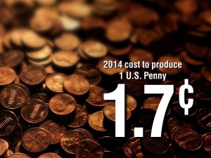
When you want to drive home the impact of a critical number in your presentation nothing does it better than showing it big — maybe really big. It is important to set up the context in advance. That may mean first displaying a slide with the full data set in a table or chart to explain the 30,000 foot view. Then you can drill down with a slide with the over-sized numbers that illustrate your point powerfully.
By |2018-12-07T19:38:46+00:00August 26th, 2017|Daily emails|Comments Off on What to do with numbers (part 4) – Go big!

What to do with numbers (part 3) – Illustrate your numbers

Graphics-illustration

So far we have seen two ways to express data to our audience:

  • The first is to simply show the full data set in a spreadsheet or table-style chart and then use large boxes (semi-transparent white) to block out the data we don’t wish to focus on and use bright outlined circles or boxes to highlight the data we do want to discuss.
  • The second is to make a graph to show the relationship of a smaller but critical subset of the numbers.
  • The third way is to more fully illustrate our numbers than just showing a simple graph.

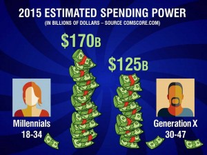
PowerPoint has a rather clumsy graph function that will automatically generate a bar, line, pie or other style graph. Unfortunately these default graphs are often more difficult to understand than just the plain data. I often choose to create a graph-type illustration from scratch like the illustration above.

If we have already shown the source of the data — the full set of numbers we have to work with — it may be a good strategy to dive in and show an important but narrow subset that makes the point we are trying to communicate.

We could just put the two numbers above on the screen, but the simple illustration of the stacks of dollar bills and the avatar-style images helps deliver our message on two levels: the numbers themselves and the visuals.

This technique of using words (or in this case numbers) plus a graphic engages your audience’s brains with two channels of communication and will greatly improve understanding and retention.

Next week: Go over the top

By |2018-12-07T19:38:46+00:00August 19th, 2017|Daily emails|Comments Off on What to do with numbers (part 3) – Illustrate your numbers

What to do with numbers (part 2) – Make a graph

Make a chart

When we present numbers to our audience, just like when we present other content, we must help them make sense of it — what does it mean to them? Often we feel compelled to show all the data in a table or list to give a sense of the big picture or to establish our credentials as an in-depth expert.

However, a large amount of information should probably not be left on the screen for any length of time. It can be too unfocused and distracting — allowing your audience’s attention to wander around into information you are not currently discussing. And, of course, large quantities of numbers require small typefaces to fit on the screen — never a good choice.

If a table filled with numbers in labeled rows and columns is a start at making sense out of a set of data then a graph with selected information is the next level. A graph represents numbers as graphic quantities so your audience gets a chance to read the numbers and see some sort of visual relationship — this should improve comprehension.

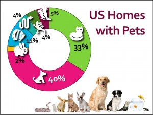
The pie/doughnut graph above keeps the amount of information manageable — it does not list every possible type of pet — only the categories relevant to the presentation.  And it shows each category’s relationship to the whole. Plus adding icons helps the viewers quickly grasp the content while adding visual interest.

Next week: Illustrate your numbers

By |2018-12-07T19:38:46+00:00August 12th, 2017|Daily emails|Comments Off on What to do with numbers (part 2) – Make a graph

What to do with numbers (part 1) – Highlight the important data

What to do with all those numbers 1

What do we do when we have to show a large data set in a presentation?

The first step may be to recognize that the presenter has the responsibility to lead his audience through the maze of numbers on the screen (hopefully not with that highly-irritating laser pointer). As speakers, we have to make the numbers meaningful.

The next step may be to understand that only so much information can be disseminated in a presentation — the details are often best left to a printed report or handout.

So how do we help our audience make sense out of the numbers we do show? There are at least 4 answers — maybe more by the time I finish this series.

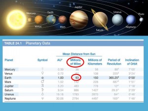
The simplest solution is to show the original complex table and then block out the unnecessary detail we don’t want to discuss and/or highlight the critical numbers we do want to discuss.

The slide above uses semitransparent white boxes to minimize the unimportant content and red circles to draw attention to what is important.

The advantage here is that we are showing the entire data set in its original table format. A disadvantage could be that the type size in the original table may be a little too small to be very legible. But at least we are helping the audience make sense out of a sea of information.

Next week: A few rules for using graphs.

By |2018-12-07T19:38:47+00:00August 6th, 2017|Daily emails|Comments Off on What to do with numbers (part 1) – Highlight the important data

Fire hose delivery

Fire hose delivery

The highly respected expert stepped to the stage and announced that he was going to “turn on the fire hose” and let the audience have everything he knows about the presentation’s topic. In a perfect world, all the brilliant insights that would tumble from his lips in this presentation would be eagerly assimilated by everyone in his audience. But in this world, that doesn’t happen. As a matter of fact, as presenters we are lucky if two or three of our important points register with just a few of the people in our audience.

Public speaking is not an efficient medium for delivering large quantities of information. But it is a superb vehicle for driving home one profound, well thought out and well-spoken concept — especially if we can stir an emotional response in our listeners.

Beware of attempting to offer too much. This is the main reason to simplify: if you tell your audience a dozen ideas they may not retain any of them; if you tell them one or two you may just change their lives.

By |2018-12-07T19:38:47+00:00July 29th, 2017|Daily emails|Comments Off on Fire hose delivery