/Tom Nixon

About Tom Nixon

This author has not yet filled in any details.
So far Tom Nixon has created 302 blog entries.

B.L.U.F. Where are we going with this?

Where are we going with this

A useful strategy when organizing your content for some audiences is to give them the big reveal upfront or close to the front of your presentation. In military terms it is often referred to as BLUF.

BLUF stands for Bottom Line Up Front (don’t you just love their ability to reduce everything to an acronym?).and it refers to the need to show the big idea now instead of after 125 slides. The BLUF strategy is often used when presenting to an executive group who has little patience for a speaker who will build a big mystery. In essence, they are requesting that you prove that their time with you will be well invested. Then, after you establish the value or bottom line of your talk you can build your case with additional details.

This technique is not for every audience nor for every presenter, but BLUF may be useful to consider the next time you are planning an invasion with JCS (the Joint Chiefs of Staff) or even with POTUS.

TTFN.

By |2018-12-07T19:38:34+00:00April 1st, 2018|Daily emails|Comments Off on B.L.U.F. Where are we going with this?

Surround your words with space

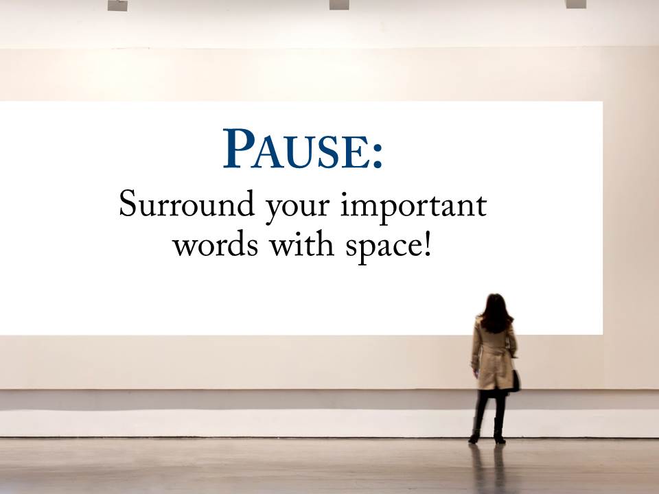
Pause - Surround your words with space

Experienced presenters and designers know the power of space. Speakers use the auditory device of the pause; for the designer it can be the visual use of white space.

In either form it it the equivalent of a stunning image viewed by itself on an otherwise unadorned wall in a museum. We are setting apart something special from the rest of our noisy world. Space (or the pause) conveys the subliminal message that this is important — pay attention. It also allows your viewers or listeners to catch up and reflect on your contents thus far.

If you are designing a slide, use space to illustrate and isolate your big idea in the same way a presenter might wait a beat or two before delivering the critical nugget of her wisdom from the podium.


By |2018-12-07T19:38:34+00:00March 28th, 2018|Daily emails|Comments Off on Surround your words with space

One image is usually enough

One image is usually enough

This is one of those “I see this all of the time…” things — slides with a patchwork of images of similar content when just one strong image would be infinitely more appropriate and powerful. Many of us seem to default to this pattern.

Maybe it is a byproduct of the slide designer/builder being unsure if they have the right visual. Or perhaps they are not confident they have stated their idea in the best way. He or she will add image upon image hoping that the repetition will help the viewer get it.

“Just one more will do it!”

In reality, it just dilutes the message. Your audience will quickly become weary of trying to see and process them all.

Find the one powerful, direct photo or illustration that tells your story in the best way (pay money if you need to — your presentation is worth it, right?) And then add just a few words to help the viewer identify the idea in their mind. Inserting extra photos (or extra words) because you are not sure if you have got it right just confuses the issue.

By |2018-12-07T19:38:38+00:00March 18th, 2018|Daily emails|Comments Off on One image is usually enough

Wanted: A good editor

Edit

A recurring problem I see when coaching professionals of all types is the lack of good editing.  Whether writing a speech or creating a visual presentation (PowerPoint, Keynote, etc.), we all put in too much information and then hate to trim it down. It is just human nature.

But the realities of live presentations are that there is only so much the audience can walk away with. The more we try to deliver from the podium the less our listeners will absorb. We must edit.

I believe good editing starts with having a big idea that everything in the presentation should  flow from. One idea and maybe three to five supporting points with examples — that’s it. Every slide, every sentence should be held up to this core idea for consistency. If it doesn’t work to deliver your main concept then it should be modified or tossed — even if you are absolutely in love with the brilliance of your creation.

The hard work of creating something worth presenting is in the editing.

By |2018-12-07T19:38:39+00:00March 11th, 2018|Daily emails|Comments Off on Wanted: A good editor

Question every slide

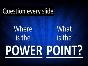
Question every slide

As you add, edit or review your slides here are 2 quick questions you can ask about each slide to see if it is just right for your presentation:

  1. What is the POINT? Does this slide have a single, clear, easily communicated message for your audience? Is it congruent with the goals of the presentation? Does it simply make sense for where it is and what it is saying?
  2. Where is the POWER? Does this slide deliver its message powerfully and efficiently? Are the graphics unambiguous and professional? Is the wording simple, direct and short? Can your audience “get it” quickly and with impact?

This simple 2 question POWER POINT? routine can help you focus and streamline your slide deck and then deliver your ideas clearly and directly.

By |2018-12-07T19:38:39+00:00March 3rd, 2018|Daily emails|Comments Off on Question every slide