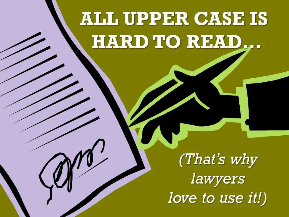
Graphic Design 101: Text, especially in larger quantities, full sentences or small sizes must, above all else, be reader-friendly. It simply has to be easy to read or your audience will not bother to put the effort into digging through it. And to make text the most difficult to read, the most uninviting, set it in ALL CAPS. (When you see all caps in a legal document you can be sure the lawyer who wrote it doesn’t want you to read it.)
Using all capital letters in a short headline can suggest importance or formality. In long strings of text the eye sees all caps as a mass of unintelligible scratching. Capital letters have no descenders or ascenders to help the reader quickly scan and assimilate the “shape” of the word. We are then forced to tediously read each letter and each word as a separate entity.
Be kind to your audience, if your text is more that a few words, avoid ALL CAPS.