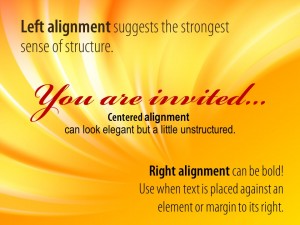
The various forms of alignment, left, right and centered, are useful ways to give your slide a feel of organization.
Left alignment suggests the strongest sense of structure. It is what we are most accustomed to and it gives the eye the feeling that there is a fixed beginning to the text. Left aligned text is easiest to read — especially in lengthy blocks.
Right alignment is often used when a piece of text is placed against an element immediately to its right or when placed against the right margin. It is a bolder look and a little less organized. Right alignment can be more difficult to read if used for more than just a few large lines.
Centered alignment can look elegant (as in a menu or invitation) but it creates the least amount of structure. It establishes weak lines of alignment for other elements on the slide as well.
Some tips:
- Align your text to other elements, to the imaginary margins or to the center line of the slide.
- Align tops and/or bottoms of elements to each other if possible.
- The more your text is aligned to other elements and text the more structured your slide will appear to your audience.
- Be careful about mixing alignments on a slide. It can be done but there should be one dominant choice.
Don’t just throw text and images on a slide. A little effort at alignment will convey the sense that you are organized and prepared (maybe even if you are not).
Next week: An important reason to break the alignment rule.
