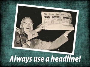
Headlines help the viewer understand where they are, what is being presented and why they should care. They are often the most frequently read text on any slide. They draw the eye and the attention of the viewer and show them where to begin. And, they are the easiest way to keep your presentation on track and focused. Yet headlines are considered optional or are forgotten in many of the slides and presentations I have seen.
Some random thoughts:
[list style=”orb” color=”blue”]
- Make your words important. Headlines are such powerful tools because they can have such a powerful effect. Use strong words, in an active voice, that reveal a benefit, show a focused point of view or move your presentation towards its goal. Avoid the wimpy!
- Tell your audience what they are about to see. Help them decide that it is worth their while to pay attention to this slide and the rest to come.
- Short and sweet is best. Edit down to the most basic, and most potent, content.
- Bigger is generally better. Don’t be afraid of using large, bold fonts. Strong words deserve a strong display.
- If you are intent on using an unusual or decorative font to tell your story, this is your chance. Be sure that the “look” of the font fits with your presentation and that your audience can easily read it.
- All caps can be OK in a short headline. Using all capital letters can make a big statement — just make sure the effect is legible.
Always use a headline? Well, never say never. There are probably a few situations where an individual slide may not need a headline, I just haven’t seen too many of them.
