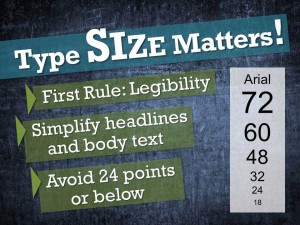
What is the correct size for type on a slide? How big should a headline be? What is the minimum size you can use for body text?
For those unfamiliar with design basics these are difficult questions. The simple (and flip) answer is “whatever works.” That doesn’t help very much. Here are some of my guidelines:
- Legibility is the critical concern. Can your audience clearly see and easily read your slide from the back of the room? How often have I heard a speaker apologize, “I know that you can’t read this but…?” Don’t ever put yourself or your audience in that position.
- Be sure that you take into account ambient room light, screen size, distance to back of the room and age of the audience. If possible test your slides in the actual room conditions first.
- Don’t be afraid of big bold headlines and spare, keyword-based text. Legible type size becomes easier if your slides are lean and simple so that they support your verbal content and don’t dominate it.
- Avoid type at the lower end of the size range. If you need 24-point text you probably have too much type (and content) on that slide. Editing is called for.
