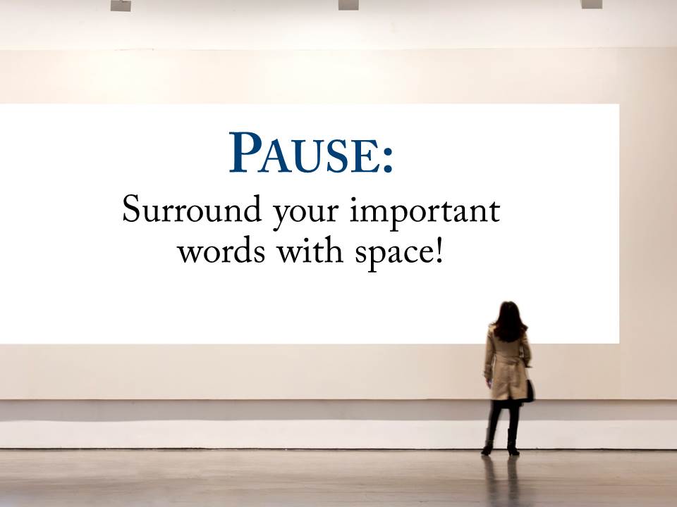
Experienced presenters and designers know the power of space. Speakers use the auditory device of the pause; for the designer it can be the visual use of white space.
In either form it it the equivalent of a stunning image viewed by itself on an otherwise unadorned wall in a museum. We are setting apart something special from the rest of our noisy world. Space (or the pause) conveys the subliminal message that this is important — pay attention. It also allows your viewers or listeners to catch up and reflect on your contents thus far.
If you are designing a slide, use space to illustrate and isolate your big idea in the same way a presenter might wait a beat or two before delivering the critical nugget of her wisdom from the podium.
